Zombie Days was a desktop game with a rough phone version. I said in the first entry that I wouldn’t repeat that. This week was spent making that true, and it came down to one rule that I’m going to keep for as long as the game exists: the map is never covered.
Sheets, and the city behind it
Every panel slides up from the bottom, and the city stays live above it. You can pan it, pinch it, watch a zombie come round the corner while you’re reading what’s in your pack, and the tap menu no longer darkens the map. This is a survival game and the thing that kills you is the thing you didn’t see, so the interface is not allowed to be the reason you didn’t see it.
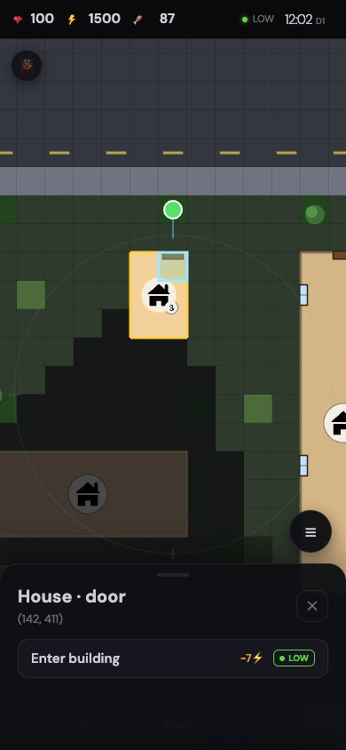
Everything else followed from that rule. The top of the screen shrank to a thin bar with the three meters, a noise light and the clock, because the map needed the height more than a header did. The character sheet and the sound log went behind one menu button in the corner. The stance control sits over the map at the bottom where a thumb already is. What’s on screen by default is the city, your three numbers, a noise light, and the time.
The building sheet
The building sheet was the hard one, because a building is the place where there’s the most to do. Search, stash, who’s here, the doors and windows and what state each is in, the stairs. The first version showed all of that at once and it was a wall. Now the sheet is a short list of rows, and each row opens into its own list with a back button. Doors and windows are one row with a count on it, and a warning on the row if one of them is being chewed on. You see the summary first and dig only into what you need. The sheet is a fixed height, so it lands in the same place every time and your thumb learns where things are.
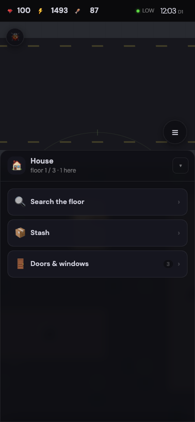
The same week changed how you get into a building at all. Before, you tapped the building and got an abstract “enter”. Now you tap the door, or the window, the actual thing you can see on the map, and the sheet tells you what that opening allows: walk in if it’s open, break in if it’s locked, break the glass on a window, squeeze through if it’s boarded. When the building is a distance away, the same tap walks you to the door and then in.
One more small thing that I like more than its size deserves. Buildings with more than one floor show a little badge with the count, readable from the street. A house with a “3” on it is a house with somewhere to go up to. It’s one more thing you learn about a building before you spend the energy to walk over, and it changes which building you pick.
The doubt is the sheets themselves. They keep the map clear, but there are moments where you want two things at once: the building’s stash and your own pack, side by side, to decide what to swap. Right now that’s a back button and some memory. I’d rather have the map than the second sheet, and I’ll find out if that’s the right trade the first time I’m trying to swap a jacket for a bat with something at the door.