Every screenshot in this log so far has been squares. Green square for me, red square for a zombie, a brown one for a door, a green block for a building. That was deliberate. I wanted the rules to be right before the picture was, and squares are honest: they don’t let you mistake pretty for good. But squares also don’t let you read a street, and reading the street is the game. This week the map got a look.
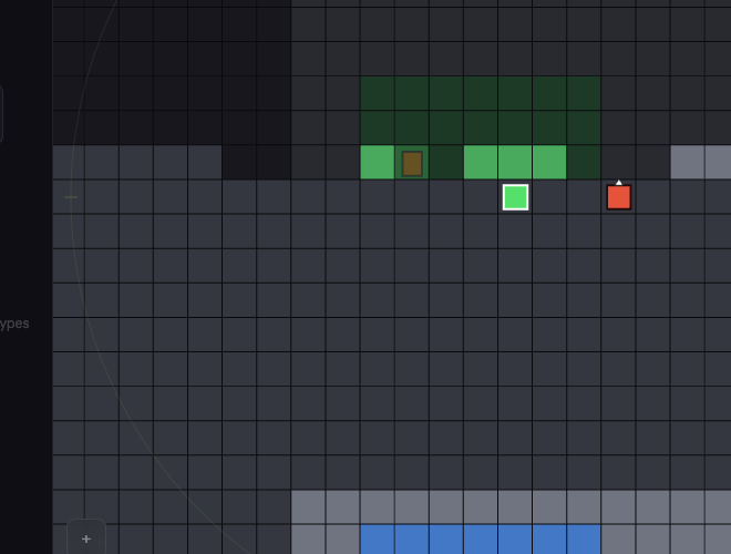
Flat, on purpose
The same morning I threw something away. Not long ago I’d added a mode that drew buildings in fake three-dimensional perspective, with walls rising off the map. It is gone. The map is flat, top-down, and it is going to stay flat. The city is a grid of tiles, and the honest picture of a grid of tiles is looking straight down at it.
Reading a building from the street
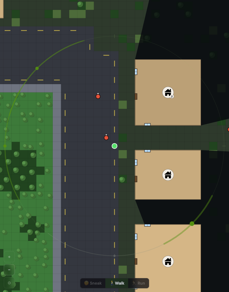
Flat is not the same as plain. A building is now one solid block of roof, coloured by what it is: one colour family for homes, another for shops, another for civic buildings, so a street tells you its character from the roof line before you’ve read a single name. In the middle of the roof sits a small badge with an icon of the kind, a house, a shop, a hospital, and a little number if it has floors to climb. Around the edge, the doors and windows are drawn where they actually are. A broken one looks broken, a boarded one shows its planks, and one being chewed on says so. Everything I said in the Buildings entry about counting the ways in is now something you do with your eyes.
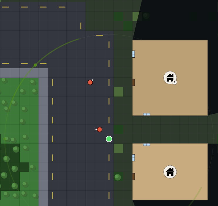
The ground got its own touches. Roads have a dashed centre line so a wide road reads as a road and not a grey field. Parks and forests grow clusters of trees. A centre line tells you which way the road runs. Trees tell you where the open land is, which is where you can’t hide.
What stayed
What I kept from the squares is the rule underneath them. Everything on the map is still a tile, everything still snaps to the grid, and the picture never shows something the rules don’t know. A zombie is a disc with a small arrow, because the rules say a zombie has a facing and nothing more. A survivor is a disc. There are no walk animations. A hit is a quick white flash on whatever got hit, and a shot is a small flash at the gun. The look is there to make the rules readable, not to add to them.